
You can’t conditionally format a bar chart in Excel – or can you? In this post I set out a couple of options for how to do this.
Why might you want to conditionally format a bar chart?
Conditional formatting can be used to draw attention to particular data points. In Excel, there are lots of options for applying conditional formatting to cells or ranges. However, you need a more creative approach to conditionally format a bar chart.
Here are a couple of options.
Formatting for negative results
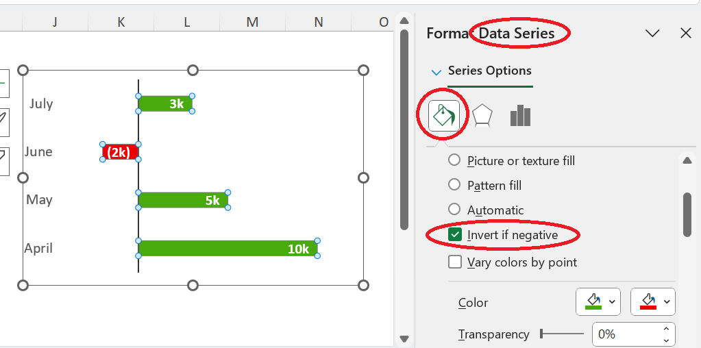
If you just want your negatives to be a different colour to your positives, there is a built in option in Excel for this. Go to “Format Data series” and within the “Fill and Line” bit there is an option to tick “invert if negative” and add a second colour.
In the example above, you could also use Databars to add a similar looking graphic which might look neater and is simpler to achieve.
You can find Databars in the Conditional Formatting part of the Home Tab. Databars are applied to cells with data in them. To get the effect pictured below, you need to copy the data into another column. Then go into “Manage Rules” > “Edit Rule” and then select “Show Bar Only”

Cheating – here I am using data bars rather than conditionally formatting a bar chart
More complex conditional formatting for charts and graphs
If you want to apply some other kind of conditional logic – i.e. “highlight everything over 50%” – you need a different approach.
First, you need to create a chart series that shows all the data. Secondly, you need to create second series that applies conditional logic to repeat the desired data only. For items that do not meet the conditional logic, you need to create an error (for example, by entering NA).
You then create a clustered column, and map the second data series over the first by using Format Data Series > Series Options and set “Series Overlap” to 100%.
This creates the graph shown in the illustration at the top of the post. In the video below,you can see that it changes whenever the input % is changed. I’ve also shown the chart area workings
I’ve also used CONCAT to make sure that the chart legend automatically updates with the selection.
(NB there is no sound in the video)
I provide bespoke Excel training to teams in Bristol and elsewhere in the UK.
Contact me for further information.
If you want a quarterly newsletter summarising latest developments in Excel and other things I've found interesting or useful, please sign up here. I won't use your data for anything else.
One Reply to “How to conditionally format a bar chart in Excel”